Mobile app stores are naturally designed to be used on mobile devices, but there will always come when one might want or even need to browse the catalogue on a desktop or laptop. Unlike the iOS App Store, Google’s Play Store has always been “web-friendly,” allowing people to search what Google offers and even install Android apps from a web browser. However, Google Play Store on the Web hasn’t exactly caught up with the rest of the company’s design changes. That’s finally happening soon, but it’s a change that might not sit well with everyone.
It has been years since Google changed how the Play Store looked on a web browser, the last one being when the Material Design language was first introduced. In contrast, the Google Play Store Android app has undergone a few major modifications since then, leaving a visual and behavioural inconsistency between the two storefronts. Soon, however, that will no longer be the case, and the Web experience will be following the mobile app, perhaps to some people’s dismay.
Granted, the web store wasn’t exactly ideal in some cases. Some found the side navigation panel to be a bit confusing, while the overall layout didn’t scale down well when viewing the store within a narrow browser window. Overall, the website was functional but not exactly the smoothest experience and was sometimes even too slow for comfort.
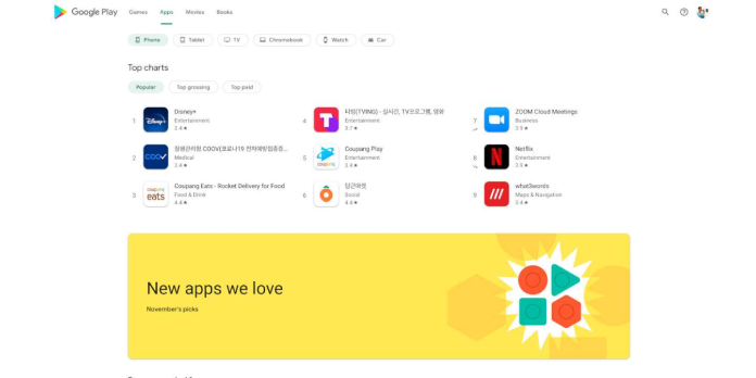
Google seems to be preparing to finally bid farewell to the old Play Store on the web, at least based on the information that Android Police gathered. The design and flow of the new website mirror what you’d find on the app version, which is a point for consistency. Gone is the navigation panel, for example, and most of the settings and options previously found there are now in a menu that drops down from the user’s profile picture in the upper right corner.
Despite its name, Google Play Store isn’t just a place for apps or games, and the new design still has sections for other digital content like books and videos. The sections are also divided among more sub-sections, the most helpful of which is the device categories under the main Apps heading. Searching for apps and content behaves similarly to the mobile app, presenting a direct link to an app in auto-complete if it exactly matches what you’ve typed out.
Not everyone might enjoy the new design, especially since it sometimes uses up a lot of whitespaces, probably in line with the new Material Design. It is reportedly faster, though, which is something that all users will appreciate. Now all that’s left is for Google to roll it out to everyone, and that might take a bit of time if it’s just doing A/B testing at this point.
Source: androidpolice


