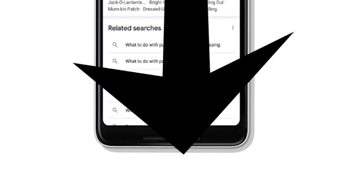
Google announced one of the most significant changes to how information is delivered in search results for mobile users today. There will be a never-ending scroll effect instead of the classic “next” or “see more” button or a list of “o” letters in the word GOOGLE for more results. Google refers to this as “continuous scrolling,” It will be available on your device as soon as this minute.
“With the introduction of continuous scrolling on mobile devices today, we’re making browsing search results more seamless and intuitive,” said Niru Anand, Product Manager for Google Search. “Now, when you reach the bottom of a search results page on your phone, the next set of results with relevant information will automatically load.”
You may already be aware of what’s going on here if you’ve heard of the term “Doomscrolling.” When you search with Google on your smartphone, you’ll see the same first page of results you always see. You’ll probably never get there if you scroll down to the “end” of the “first page” of results.
On your mobile device, additional results will be automatically loaded, with no obvious option to scroll through pages in any other way. This situation does not appear to be the default on desktop browsers just yet. The Gooooooogle will still be visible.
Update: It appears that this new Search scrolling situation will first appear in English-speaking countries, with mobile devices in the United States being the first to be affected. The continuous scrolling experience will “gradually roll out” to users starting today, according to Google.
Is this a good change, or would you prefer to keep the tap-to-advance method for mobile search as well? Check out Google right now to see if it scrolls indefinitely, and don’t get lost in the abyss!
Source: google


