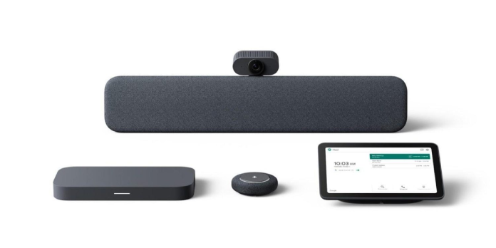
The Google Meet redesign will now be available for dedicated video calling hardware like Chromebases following the web rollout. Again, this is to ensure consistency across platforms and a seamless experience.
The experience on all-in-one touchscreens with Chrome OS is almost identical to that of the web. The experience starts with a clear, easily readable bottom bar that houses all the key controls. The right corner houses the meeting dial-in codes and attachments. Chat, chat, and all other actions can be found in the lower-left corner. Time and the meeting name are located in the upper left.
Blue is used to outline the tiles of people speaking, while mute indicator tiles are less visible due to lower visual distraction. A tile will display participants who aren’t currently visible due to too many people.
You can also toggle between your feed being a grid tile or floating windows that can be moved around, and you can unpin content that others have shared.
Google has given Meet hardware kits rounded corners and used the Google Sans font all over. In addition, a new color scheme is being used on touchscreen controllers and displays (dark green replaced with blue).
Self-view for hardware kits is shown in the upper right corner. Unfortunately, it cannot be removed or resized.
This redesign will be available to Google Workspace customers who use Meet hardware devices starting July 7.


